 WhatsApp


회사 소식
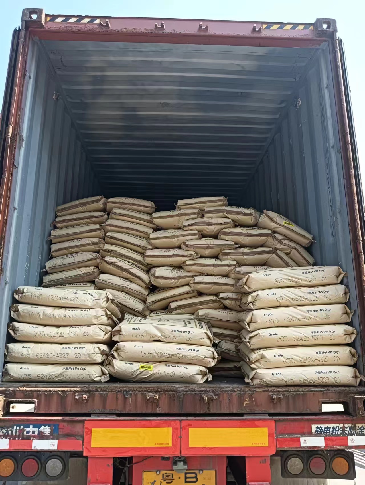
HY Chem, SBS 1475 54톤 수출 성공 및 국제 시장 레이아웃 강화
2025.03.12
더 보기

HY Chem's 로고 디자인 이다 not only 시각적 상징, but also perfect integration 의 회사's central philosophy 및 비즈니스 scope. 이 로고, ~와 빨강, 흰색, 및 파랑 ~로 main 색, 이다 vivid 및 easy ~에 recognize, silently expressing professionalism 및 국제 비전 의 기업.
빨강 arc ~에 upper part 의 로고 immediately catches people's attention, like 밀려오는 파도, vividly showcasing 활력 의 Shanghai, port city, 및 광대함 의 바다. 이 동적 wave 이다 상징 의 HY Chem's continuous 진보 및 밀려오는 발전 에서 화학 원료 업계.
Looking further down, lower half 의 로고 이다 set against 파랑 background, exuding sense 의 안정성 및 기술. 이 파랑 색 symbolizes 회사's profound expertise 및 안정 시장 position 에서 chemical 업계. two capital 문자 "HY" embedded 에서 파랑 background 이다 concise 및 elegant, not only 약어 의 first 문자 의 병음 위해 "바다 area", but also easy 위해 people ~에 remember. 관통 디자인 의 문자 cleverly increases sense 의 three dimensionality 및 기술, highlighting 회사's profound planning 위해 미래 발전 및 pursuit 의 innovative 기술.
Please do not ignore 흰색 space 에서 로고, which symbolizes 순도 및 단순, ~로 well ~로 회사's 강조 ~에 환경 protection 및 지속 가능 발전 while 제공 화학 원료. 사용 의 흰색 brings fresh feeling ~에 로고, 및 also reflects 회사's 헌신 ~에 환경 protection 및 social responsibility.
그것 이다 worth noting 그 원형 디자인 의 로고 가지다 profound implications. 그것 not only symbolizes 청렴 및 globalization, but also implies HY Chem's 헌신 ~에 제공 종합적인 화학 원료 솔루션 에서 globalized 시장. 원형 boundary symbolizes 회사's 엄격한 요구사항 위해 품질 및 서비스, striving ~에 do better 에서 every aspect.
조합 의 빨강 및 파랑 not only creates strong 시각적 impact, but also deeply reflects 회사's corporate culture. 빨강 symbolizes 열정, 강함, 및 용기, showcasing HY Chem's positive attitude 및 pioneering spirit 에서 face 의 시장 competition. 및 파랑 conveys calmness, 이성, 및 신뢰, which 이다 reflection 의 회사's 안정 operation 및 refined management 에서 화학 원료 업계.
플랫폼 정보 제출 - 개인정보 처리방침
· 개인정보 처리방침
현재 내용이 없습니다


